Friday, April 27, 2007

Ambition

.. can bite you both ways

When you have ambition, even in the smallest amounts, it means you want to achieve something. You want to reach a goal. Sometimes the goal can be vague like doing something good or make the world a better place. Or a goal can be to win a gold medal at the next Olympics. Easily measured, but difficult to achieve.

Ambitions make the world go round

If nobody had any ambition than absolutely nothing would be achieved. Having ambitions is vital to progress and, I claim, having ambition is vital to having fun. The feeling of achievement when you get closer to your goal is essential to your joy in life.

But ..

When your ambitions do not line up with the ambition of the organization you work, well, Houston, you have a problem.

There two situations. Your ambitions are lower. You may be in something like survival mode or the organization has the ambition set for world domination by the next quarter. Or something more subtle. This difference means you have to do more than you aspire. This means running faster than you want and maybe can. You will draw the short straw sometime soon. You are likely to work under a load of stress trying to liveup to the ambitions of over eager boss. Best thing to do is, tell the boss. If he/she does not listen, then find another job.

Or ..

The other situation is equally bad if not worse. When your ambition is bigger than the ambition of the organization. You make plan after plan, you give carefully prepared presentations. You do a lot of research and even start lobbying for support on any level. To no avail.

Extra painful: they fully agree with you. Your plans make sense. It is the right thing to do. Even the right way to do it. But they agree only in word not in action. Not on paper or in email. So, there is no real support: you are on your own.

You are likely to become completely disappointed by all management. Especially, when profitwise the organization is doing very well. But oh, you know, it could have been doing so much better!

So, again after fighting all the windmills, there is only one thing to do: find another job.

And better believe me: been there, done that.

Tuesday, April 24, 2007

Web Design Survey 2007

I took it

Really!

Sunday, April 22, 2007

Clean Semantics: the three column attempt

.. when things get ugly?

In my previous posts about Clean Semantics I have explained a bit about my philosophy of Clean Semantics. Trying to get rid of the div tag soup and only use the real semantic markup. Driving it to the extreme (I know) and literally avoiding any tag that has no direct semantic value. Call me a Semantic Fundamentalist.

I have shown markup for a simple layout with a header, a menu and a content area. But I left with a cliff hanger regarding a three column layout.

Three columns: first attempt

My first attempt was using some form of positioning to place the columns left and right. Positioning the top element of both the left and right column was easy: place them just below the header and to the left or right. But I could not really find a way then place the next elements below these first. There is no way of knowing the height of the elements. So I sighed and came up with the old fashioned way: wrap the columns in a <div>. Sigh! Here's the example of a three column design using only two <div>'s.

As you can see it works. I have placed some different types of elements in there and it behaves all in all like expected. And only two <div>'s! And the content is a nice order. The columns follow after the main content, which is good practice for search engines. But the order can be swapped about, layout stays the same.

But those two <div>'s in there are not semantic. So for a Semantic Fundamentalist, like me, they are two too many. It did not give me the feeling of having achieved anything.

Three columns: second attempt

So I decided that positioning was not the right solution path for the problem and I returned to good old floating.

I mentioned that it would be relatively easy to combine my first example with the menu on the left with my third example with a horizontal menu. Then if I just add some right floated content I would be well on the way.

The sub menu has the same styling as the menu in the first example. The content on the right is just floated to the right and with clear to the right to move the item below the previous one.

float:right;clear:right;

This was indeed not too difficult, see the example.

I may have lost the source order independence, but still I can live with that. I also have a feeling that this could be the right approach.

Three columns: third attempt

In the previous example I have take a small step with floating and clearing to the right. So let's do the to the left as well.

float:left;clear:left;

Sounds just so simple. Why I ever considered positioning I don't know. My first angle of attack is usually floating things into place.

So, the simple floating and clearing left and right could do the trick. Here is what I made of that: three column layout with no <div>'s. Do me a favour and view it using Internet Explorer 6. Yes, you read that correctly. In Internet Explorer 6 this markup and styling works. In Firefox things go a bit awry. To me it seems the floating and clearing rules are interpreted differently. And IE7 does the same thing as Firefox, so maybe the bus is in IE6? Hmmm, too bad.

I have only tested the layout in Firefox and IE6 and IE7 so far, so using a different browser will probably show even more possible outcomes.

But which is right? IE6 or Firefox & IE7?

Remains the question: which browser does it wrong? Or more simple what do the rules state as correct floating behavior?

Let's look up the W3C rules in CSS 2.1.

The W3C's CSS 2.1 definition of float
A float is a box that is shifted to the left or right on the current line. The most interesting characteristic of a float (or "floated" or "floating" box) is that content may flow along its side (or be prohibited from doing so by the 'clear' property).

In the image this rules is visualized. When floating to the right, the elements go all the way to right until they can not move any further, because they reach the right edge of the containing element or they are stopped by another right floated element. When the element is cleared to the right it does not allow for any elements to be on the right, it clears those away or rather takes the easy way out and moves down a bit so that it can snuggle up against the right edge of the containing element.

When I then combine the right float and cleared elements with left float and cleared elements I expect something like the picture below. A neatly stack of elements on the left and right side of my containing element. Just like IE6 shows it. So, in my interpretation Firefox and IE7 have a bug rendering the markup and styling. It is a hard conclusion to draw here, but I think it is true. Looking at how the markup is rendered in Firefox and IE7 I have the feeling that somehow elements that are cleared on the right are also cleared on the left, but not all. The last floated element to the right has no influence on the vertical position on the first left floated element. Multiple floated and cleared elements to one side apparently make Firefox and IE7 only remember the vertical position of the last element. Anyway, this approach is not rendered consistently enough across different browsers to use it. Let's forget it.

What to do?

What can I do now? It seemed to be going so well. Can I still find a workaround for this problem or should I just let it be and stick with using two <div>'s?

I'm not giving up yet. I will give it another try. Meanwhile, if anyone with another browser can tell me if that browsers shows my three column layout with no <div>'s correctly or not, please do. The comments are open.

Update

Now that I have Safari 3 beta for Windows on my machine I see exactly the same appearance as in Firefox. So, taking into account the execllent performance of Safari in the area of standards compliance rendering I think I must take back my conclusion to the bug in Firefox.

The correct rendering of Internet Explorer is just a lucky bug.

This article is part of a series of four

  1. First steps towards Clean Semantics
  2. The shape of Clean Semantics
  3. Clean Semantics: the three column attempt
  4. Clean Semantics in practice (Will follow shortly).

Friday, April 20, 2007

Standard Screen Resolution

.. is it me or is the world getting bigger?

This is an update to an older post of me: A new Standard in screen resolution?. In which I state that you should design your pages for different media (by serving the correct stylesheet using the media attribute) and that you could also serve different stylesheets by detecting through JavaScript the user agents viewport size (in normal language: the height and width of the browser window).

That's all very clear. I think.

But ..

Yes, there is always a but. You have to be unobtrusive with JavaScript as we all know.

If JavaScript is turned off we still need serve a reasonable styling. (If CSS is turned off as well we better have design a semantic page!) So, the best approach imho is to design for a screen resolution that will suit the most users.

That means you need to find the size that will fit most visitors. Through some web statistics this can be achieved quite easily.

Give me the data, Data

I have checked the statistics of a Dutch insurance company for this year (2007 until 20th April) and that means a total of 846,278 visitors with a shocking number of 436 different screen sizes!

When put these in a bubble graph width screen width and height as axes we see the following picture. For the sake of argument we'll forget about handhelds for now.

What we see is that the biggest slice of visitors have 1024x768 screen, 56% of them. So that seems like reasonable standard screen size. But there is still that blob of 800x600 screen users. So what happens if use the 1024x768 size as a basis. We'll make it a bit narrower to cater for the browser chrome. We'll use a screen width of 960px.

If we use this number we'll miss out about 6.5% of our visitors. Well, not exactly miss them. These users will most likely see a horizontal scroll bar. Some people say that's not done, but it still is the approach we took at the insurance company. Our design is such that we have a sidebar on the right and the main content on the left. This main part is less than 800px wide so we decided that even though the visitors with narrow screens would still see the most important bit of the page. The sidebar is extra, optional content.

Originally we had designed the site for 800px wide which would potentially be too wide for 0.09% of the visitors. These would mainly be handheld visitors. They would get a different stylesheet anyhow.

So, what's the conclusion?

I would say that it makes perfectly sense to design for a screen width of 1024px. Only a small portion of the visitors will suffer from that. But the other way around if you design for an 800px width you will serve the vast majority of your audience a lot of wasted screen real estate.

On top of that if you would implement the JavaScript screen size detection as referred to in my previous post of the 6.5% with a small screen would only suffer if they have JavaScript turned off. My numbers for that are that only about 5% have that turned off. So most likely less than 1% will suffer from your decision to use the width of 1024px as a design parameter.

Final note

Maybe one day we will all have these huge screens like two visitors that we had: 5120x2048! I would sure like one or is it a stack of 10 monitors?

Wednesday, April 18, 2007

The shape of Clean Semantics

.. going minimalist

As I have written before I wanted to try t get rid of all these extra tags, get rid of the div soup. I set out on a journey not knowing if I would ever reach the destination or where that destination would be.

Zen's something you can reach through either green tea or black coffee. Cappuccino works fine as well.

Fill your cup and come and join me on my journey to Zen. Let's take the yellow brick XHTML 1.0 Strict road.

The examples I have created have been tested in Firefox 2.0 and Internet Explorer 6.x.

First challenge: keeping it simple

It's time to start virtually breathing again. A centered, fixed width design with a header, the menu on the left side and a one column content area We start off with this very simple layout. A centered, fixed width design with a header, the menu on the left side and a one column content area. We'll add a footer later.

Taking little steps

First of all we need a centered layout on a different background color. To achieve this we need two elements: one for the background and within that one we need another one for centering the rest of the stuff that goes inside.

Traditionally we would grab a wrapper <div> and put a width and the centering

margin:0 auto;
styling on it.

But let's quit with traditions and forget the wrapper <div>. Let's think again. We need two elements and we also know the styling. Think again. Every web page you look at always has two elements at least. What about the good old <html> and the equally important <body>. Just use these two elements. Give the body a fixed width and center it within the body.

Can you get any more semantic? The <body> node holds the body of the web (<html>) page. That's what I call Semantic with a capital S.

Now ease along to the next step

Let's have look at the header. The best tag for that is no doubt the <h1>. No discussion. For fun we throw in a logo image. Simply contain that within the <h1>.

Now for styling. Give the h1 sufficient height, well more than the font-size. Make the line-height the same and make sure the margin at the top is zero. Float the logo to the left and add some padding around it so it fills the height and has some room so the text of the h1 stands nicely on its own.

h1{height:120px;line-height:120px;margin-top:0;}
img#logo{float:left;padding:10px 12px 13px 90px;}

Well, that finishes the header.

The next step is a bit more tricky

So far so good. So far everything is fully semantic. Now we get to the trickier bit. The menu on the left. Semantically we do not have a <menu> tag in XHTML 1.0 Strict. However, luckily it's completely normal to use an unordered list (<ul>) for an unordered list of links as a menu. Semantically close enough to still say that's pretty clean.

Using one often used method let's turn that into a vertical menu adn float it to the left.

Final step is coming

Leaves us with the content. For that I use sub headers (<h2>) and paragraphs (<p>). Again, a big semantic cheer from the crowd.

Simply put a left margin on both the elements to have enough room for the menu and add a bit of padding on the right to make it look good.

h2, p {margin-left:180px;padding-right:35px;}
h2 {padding-top:0;}
That was that!

And there we are. We have arrived at our first destination. A very clean and lean piece of xhtml and css. No extra fluff. No soup served. Neither div soup, nor table soup.

Have a look at the result.

Variety killed the cat

Now, just have a look at some variations:

Interesting exercise, so far

All right, this is indeed all clean semantics. But is it of any real use? This layout is very minimalist by itself. Can it be expanded to real life situations? How far can we push the envelop

Can we for instance create something like this blog layout? A header, a sidebar on the left and one on the right?

With some little imagination we could add another (sub) menu on the left side styled like the menu in my first example. But how about the right sidebar?

Cliff 's still hanging

Again you must virtually hold your breath. I have made some progress in that area. I have come close, but I have it only rendering the way I want it in just one browser. The other one does unexpected things. It's not the one you would expect.

I will have to go through the W3C specs to find out which browser is rendering correctly.

Until then, have a good semantical time!

This article is part of a series of four

  1. First steps towards Clean Semantics
  2. The shape of Clean Semantics
  3. Clean Semantics: the three column attempt
  4. Clean Semantics in practice (Will follow shortly).

Tuesday, April 17, 2007

Firefox usage grows slowly

.. but steadily

As the French research Xiti shows in its recent report Firefox usage is steadily progressing in Europe.

Looking the average of Europe we see a steady climb from 19.4 % to 24.1% over the last year. Adding an almost 5% share! Impressive to say the least. The share has been growing more than 24% in a years time. Wow!

These are still very good numbers! I would have thought that growth would maybe slowdown, but no. It is still going steady.

Worldwide we see that Australia has the biggest Firefox share, 24.8%. 
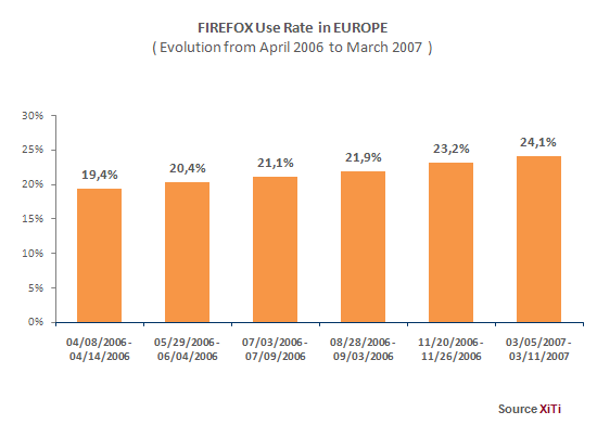
North America is a bit behind on 15.1%. But looking at the numbers for the Netherlands they are still ahead of our 13.3%. That number has dropped 0.7% since last November. Weird.

It only goes to show that there are lies, big lies and statistics.

Thursday, April 12, 2007

First steps towards Clean Semantics

.. just a few careful ones

Some of you may have read my post on finding Zen in the Garden or the prequel to that one stating less is more. These posts may have tickled your brain and may have made you wanting to know more. Then again you may have not.

"Front-End Architect"

Some time ago I have read an article on the 72 dpi In the Shade site. The article was fun to read as it provided 10 CSS tips from a Professional Front-End Architect. A job title that I hadn't encountered before. The writer had originally used the job title "Professional CSS Architect". A title that strikes me as even more odd. I am considering using one of these titles in the future. Once I can give some meaning to them, that is.

Anyhow, that was not the point of me referring to the article. Nor the tips and the hilarious long list pointing the author to mistakes he makes himself despite his well intended tips. It's fun to read and a good laugh, do take the time. But I get away from the subject.

The thing that triggered me in the article was the point about keeping containers to a minimum. While looking at some of the code I made for the website recently I once again was shivering with some of the markup I produced. Wrapping stuff inside empty and un-classed div elements! Huwuwrruurrg! Just too horrible for words.

It's a disease

Even though admittedly I was handed the first rough version of the markup and probably was a bit too shy to really rip it apart or even better, just throw it away and start from scratch, I am the one responsible for the markup. At least for a few more days.

I got a spot of the disease that many "Front-End Developers" suffer from in the beginning of their career: div-itis. Just throw in another wrapping <div> to move elements into place. Yes, I am guilty. I may have never served table-soup, but div-soup was on the menu.

But I must also say that while progressing with the markup to cover more and more of page templates I made it leaner and leaner. Nowadays I think long on which element is the best for the job and try to use just that single element and only put a wrapping <div> unless I cannot think of a way to style without it.

Yes, I have bettered my life and will continue to do so.

Roho
Yes, I am guilty. I may have never served table-soup, but div-soup was on the menu.
Make it clean and lean

The article mentioned above made me think on minimizing containers. It made think on styling without using any artificially added container.

The challenge is produce only true semantic markup. Since, where's the semantic in a <div>?

First challenge: keeping it simple
A centered, fixed width design with a header, the menu on the left side and a one column content area

Let's consider this very simple layout. A centered, fixed width design with a header, the menu on the left side and a one column content area. For now just forget the footer.

Doing it quick and dirty we need the following:

  • A wrapping <div> to center everything in the browser.
  • A <div> for the header
  • A <div> for the content and the menu
  • The menu can be just a simple <ul>, we don't need the extra <div>. (Already doing some clean thinking here, better put another <div> around it.)
  • Finally, let's wrap the content in a <div>

So, there we go, a simple design and already we have four or even five <div>'s in there. We can put meaningful ID's or classes on these and feel already semantic. But no that's not really true. The <div>'s remain semantically void.

Challenge for you

I have wrestled a bit with this simple layout and have come up with a solution that uses no <div>'s what so ever. Only true clean semantic markup is used. Better still I only used one ID for the menu to be able to use <ul> within the content.

I have even extended the layout above to be more realistic without breaking the clean semantic markup.

The challenge for you my dear reader is that you can have a go a creating this layout without using any <div>'s.

Cliffhanger

No, I will not show you until a next time.

I am busy completing the example files and placing them on my web server. Until that is done I ask you to, virtually, hold your breath.

This article is part of a series of four

  1. First steps towards Clean Semantics
  2. The shape of Clean Semantics
  3. Clean Semantics: the three column attempt
  4. Clean Semantics in practice (Will follow shortly).