.. what to think of it
Over on Ars Technica is a post that gives a little trick to get a glimpse of the Google future. With just a tiny dose of JavaScript you can get a new style of results page.
How to get there?
Go to your Google page and paste the following bit of JavaScript in your address bar and hit Go..
javascript:alert(document.cookie="PREF=ID=fb7740f107311e46:TM=1142683332:LM=1142683332:S=fNSw6ljXTzvL3dWu;path=/;domain=.google.com")
Note replace the domain with the correct version you use (e.g. google.nl or google.co.uk, it is not guaranteed that it works on all domains, however.
What do you get?
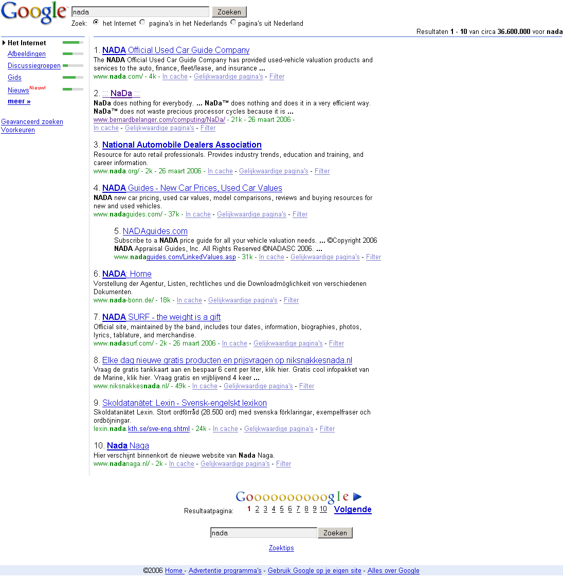
In the screen shot below you can see some minor changes. (Tip Click image to open it in a new window.)

The most interesting is the left side bar with the bar showing the number of results in the different categories. This gives some clue to what results are available.
For the rest there does not seem to be too much changed. Which is a good thing. The overall minimal look and feel is one of the powers of the Google experience and should not suffer from too many enhancements. No bells and whistles please. Google seems to stick to that approach.


Hey Roho,
ReplyDeleteWould you mind removing the *BREAK* in your snippet? This causes my browser to choke on it and I have to use Notepad as an intermediary...
Thanks!